If you’ve used the various Depth and Complexity jpeg icons out there, you’ve almost certainly run into a big drawback.
You know what I mean.
![]()
Drag an icon into Word and BOOM your layout explodes. When I drop one into a PowerPoint presentation, it’s always the wrong size. If I stretch them out, they get all pixelated.
Instead? Emoji!
These images are difficult to use even in multimedia-friendly tools like Word or PowerPoint. What happens when a student wants to include an icon in an email or some other text-based app? If students can’t do this easily, it diminishes the usefulness of Depth and Complexity. Depth and Complexity should be something kids can use all of the time. As we do more and more digitally, this is going to become a bigger problem.
Emoji are actually the perfect solution for this situation. They are easy to type into any app, they’re available on any device, they scale like a regular font, and they’re free! Oh, and they’re really fun, too. Look how easy emoji are to pop into Word:

- On a Mac, press control+command+spacebar
- On Windows, it’s Win+period or Win+semicolon (or so I’ve read!)
Table of Contents
- A Suggested List
- Your List Can Be Different
- They’re Students’ Tools
- They Improve Some Icons
- Why Emoji Are So Flexible
Emoji Possibilities
Here are my thoughts about which emoji would work with which Depth and Complexity prompts. I’ve broken them into three categories:
1. Obvious replacements for existing icons.
These are natural fits as they look just like the official icons:
- Big Idea: 🏛️
- Details: 🌻
- Language of the Discipline: 👄
- Trends: 📈
- Unanswered Questions: ❓
- Multiple Perspectives: 👓
- Change Over Time: ⏳
2. No obvious replacement, but I like them (better!).
There aren’t emoji that obviously fit with Ethics and Rules. BUT! I think the justice scales and traffic light emoji work even better than the jpeg icons. They’re easy to draw and connect pretty clearly to the meaning of their Depth and Complexity prompts.
- Ethics: ⚖️
- Rules: 🚦
3. Not so sure.
And here’s the last group. I think these work, but I’m not 100% thrilled with them.
- Patterns: 🌀 A spiral is definitely a pattern. But is this the best emoji to represent patterns? Send me your thoughts. (Friend of the site, Julie Paik, recommended the checkered flag 🏁 since it has a pattern of colors and shapes but also has a beginning and end. Nice!)
- Across Disciplines: 📚 I like the stack of books to represent multiple disciplines, but it’s less obvious when kids draw it. Might look like just three rectangles. But maybe that’s ok?
Remember, an icon just symbolizes an idea. The particular icon is not the focus; the idea is. If you use one clock, and I use another, we can still tell we’re both thinking about how something Changes Over Time. And that thinking is what matters.
At Byrdseed.TV, we use emoji in all of our Depth and Complexity videos.
Students Own These Tools
Emoji open up this incredible discussion with your students:
How would you symbolize Ethics, class?
Your students get to decide how they would represent repeating Patterns, unbreakable Rules, or Multiple Perspectives. That’s powerful! It brings us back to the true purpose of having icons at all: to represent deeper and more complex thinking. And it’s so much more interesting than opening the year by telling students “This is what Ethics looks like!”
Seriously, it bums me out that I (a pre-emoji teacher) didn’t get to do this activity with my own students
Yours Can Look Different From Mine
Perhaps you’ve noticed there’s actually no single version of emoji. Every company uses the same set of emoji, but different implementations. So Apple, Microsoft, Google, and Twitter all have slightly different emoji. Look at all of the different versions of “Face With Hand Over Mouth”.

I love this because it reinforces that there’s no “correct” symbol. Remember, the icons are students’ tools. Students should have ownership of them. As I wrote earlier, when I started teaching, we didn’t have official, professionally designed icons. We used random clip-art or drew them by hand.
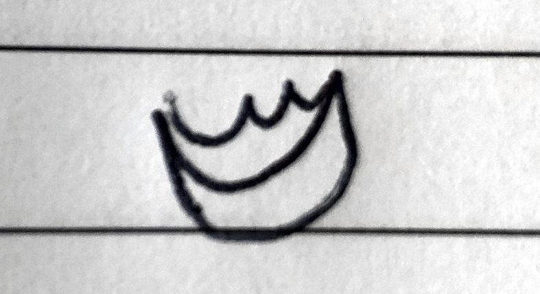
My hand-drawn Language of the Discipline lips were notoriously weird (check them out!), but my students got a kick out of it and knew what they symbolized. The emphasis was on the thinking that those lips symbolized, not the lips themselves (what a weird sentence).
Your phone may have different looking lips than my Chromebook. Your laptop might have different ethics scales than the ones on Twitter. But that’s fine. The symbols aren’t the focus, it’s the idea behind the symbol that we care about.
Improving on the Icons
I even think emoji lets us improve on the official imagery. Like, um, why are Big Idea a Greek building and Details are a flower? So weird, right? Let students make it better.
Since Big Idea and Details work so nicely together (one is zoomed-out and one is zoomed-in), why don’t we take advantage of that connection?
- This year, we could use 🌳 for Big Idea and 🍃 for Details (forest vs tree)
- My group wants to use 🌊 for Big Idea and 💧 for Details (ocean vs a drop)
Either set clearly represents the idea of zooming out to see the big picture and then zooming in to see the details. Let your students improve on the existing symbols! See what they can come up with.
Content Imperatives
If you also use the Content Imperatives, then there’s a set of emoji that work beautifully with each of those prompts, too!
- Origin – ⏺️
- Paradox – ↔️
- Parallel – ⏸️
- Convergence – 🔄
- Contribution – ⏬
Emoji 101
Finally, here are some technical reasons why using emoji works so nicely as digital Depth and Complexity icons.
- Emoji are automatically everywhere. You don’t have to download and install them. Whether you’re on Windows, Mac, a Chromebook, a phone, or some VR doodad that hasn’t been invented yet, it has emoji built-in!
- Emoji are standardized. Whatever device you use, the set of emoji is the same – even if they look slightly different. This is because there’s an official gosh-darn consortium that regulates emoji!
- Emoji are native. Devices treat them like plain ol’ letters. So you can resize them just like text. They plop right into textboxes. They work in any app that you can type into. And, thank goodness, emoji won’t break Word’s layouts!
- Emoji are designed to be small, but the jpeg Depth and Complexity icons are designed to be poster-sized. If you scale them down to match a 12pt font in Word, they lose their readability. Emoji are meant to be text-sized.
- They’re legal! Unlike the jpeg icons, which are under copyright, there are many versions of emoji that are completely free to use. Emojipedia has licensing information.
Does this mean you can’t use professionally designed icons at all? Of course not. If you like the posters, buy some and hang them up! Although, I personally like my students to create their own Depth and Complexity posters. If you like the magnets, use them! The point is to empower students to be able to use Depth and Complexity in any context. As we move more and more towards digital tools, we need a good solution for bringing Depth and Complexity with us.
Emoji are a surprisingly elegant solution. There’s even a Depth and Complexity Chrome extension.
Read the complete guide to Depth and Complexity.
Like what you read? Byrdseed.TV has 700+ ready-to-use video lessons for gifted students. Press play and your students are learning.
Try Byrdseed.TV free →