

When my students worked with graphs, I had three types of tasks:
- Level 1: Read a graph.
- Level 2: Make a graph from a table of provided data.
- Level 3: Gather “real world” data from classmates and make a graph.
But each task stuck at the bottom half of Bloom’s. At best we’re Applying. So how do we get this up to Analyze, Evaluate, and Synthesize?
Sell A Fake Story
I’ll reach for a technique that I call “Find the Controversy!” (more about finding controversy here.) Graphs are often PACKED with controversy because they are a powerful tool to tell lies!
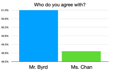
Is this graph true? Yes. Kinda. But it’s incredibly misleading. Mr. Byrd has 51% of the vote and Ms. Chan has 49%. Is basically a tie. But I’ve constructed the graph in such a dishonest way that I appear much more popular than my colleague.
This is how we can inject high-level thinking into this math topic. Something is true… yet also sort of false. That is interesting – and I want to aim for interesting (more about that special word here).
The Upgrade
So here’s the re-frame of my bar graph project:
- ❌ Ask your friends what their favorite pet is and then make a bar graph!
- 👍 Design a graph that uses true data to tell a fake story.
This is key: to move math towards high-level thinking, you have to cross content areas. Our new focus is quite language artsy, right? When math is isolated, it stays at the lower levels of Bloom’s. Connect math to language arts, science, social studies, etc and you’ll find the depth. I wrote more about that here.
I’m going to build the task around, “What kind of fake stories do graphs sell?”
A Wonderfully Awful Example
We can look at examples of bad graphs and ask what fake stories do these tell? This website gathers examples of misleading graphs.
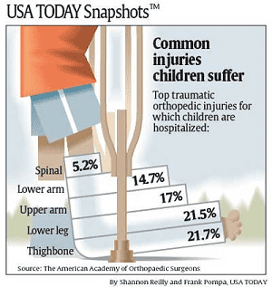
For example, this graph makes it seem like ~20% of all children will get thighbone injuries and 5% of all children will have a spinal injury. But, really, it means that 5% of “traumatic orthopedic injuries for which children are hospitalized” are spinal injuries. That is a VERY big difference.
Students’ Task
Then, students’ task will be to use real data to sell a fake story. Now that is VERY high-level thinking!
In the end, we can tour the graphs. Students can pick the most impressively untrustworthy graph.
So much better than merely graphing My Classmates’ Favorite Pets.